In regards to blogging: while I really do enjoy blogging about what I'm doing design-wise I definitely devote time to my game design rather than blogging when time is limited.
Honestly my time is limited 4-5 days a week because I work full time, have a family including a 2 year old who needs lots of attention before bedtime and a wife who deserves more attention than I give her for sure!
So with that in mind I may try to do a weekly posting digest rather than daily but well see what I can fit in, just don't take 4 days of no posts as nothing is going on - because its definitely not true.
That being said about blogging the next thing is motivation. I think sharing with community is an essential part of being motivated. I do share my dev log and accomplishments here, as well on the TGC forums.
When doing so here I try to not just do a text dump ; but I think I need to just go ahead and "OK" that mentally. I think it may make interesting reading for some and will certainly be very interesting after the fact once I publish the game and if it does well people may come back and go "oh so that's what he was thinking, or how he did this item."
Right now I'm just a lone indie shooting off bottle rockets into a sky filled with stars. But should I through blind luck and a lot of elbow grease some how do well with this product all of a sudden these little posts will be re-interpreted to be some how deep and meaningful and hold insight into how you might make the next big casual indie game right?
It's quite funny to think how hind sight may effect perspective of what I am doing today eventually.
So anyways on to the point. Lets start with this very early screenshot of the main menu. This screenshot was during the time when I had made extremely simple place holder graphics in an effort to STOP myself from screwing around with graphics constantly instead of coding:

Read more after the break ..
Extremely simple and clean , with a silly fake company name and zombi-con for some flavor & personality at the bottom this screen actually was a minor inspiration to me. It reminded me that simple, clean and nice looking graphics are in fact acceptable.
It wasn't until much later when my personal "beta 1.0" list was checked off and delivered that I put in this more polished screen:
This screen stayed for some time as I fine tuned the actual game play screen - which arguably was more important.
But eventually I knew that it had to improve so I went through a set of rapid prototype's to improve its graphics -without spending an exorbitant amount of time on any one of them.

I wanted to spend no more than 1 hour on 3-4 new screen's and then would figure out which I liked the best and polish that one up even further.
So my next attempt was a pirate's grotto which was shaping up nicely - but taking an extensive amount of time in Adobe Photoshop. This really is not my kind of work right now .. I can do it but it is time consuming and does not look as good as when other's do it (in my opinion anyways right).
But it was indeed interesting and I think still has some appeal. But really to bring it together would take me many more hours and I decided to drop it here and move on to my next effort which after several hours in Photoshop I decided I needed to go with Adobe Illustrator for my next go around and came up with this item:

It has a minimal bit of appeal in that its an "okay" pirate ship but in the end every one hated the black sails and I didn't like anything else about it. Sure it would have been easy enough to change the sails to white but in the end if I didn't like anything else about it why spend time on it? And this I think was a good decision. 80/20 rule right? Spend 80% of your time on something you can be productive with and 20% of your time on something that is either not productive or low productivity. This was a good use of an hour to knock out the idea of a pirate ship for the menu but cut & run when it is clear it's not doing anything magical.
Next up we have this little guy which took me all of 15 minutes:

I know your calling bull crap at this point but its true!
All I did was take a map I had made several years ago for an indie MMO project I was working on and use a couple of overlays in Photoshop to give it some shadow and highlights.
I then copied some clippings off of stock wood photo's and used Adobe Photoshop's bevel and emboss layer style tools to give the sign post a look that matched the lighting.
About 2 minutes of tweaking the lay out and adding text on the sign and literally 60 second to do the dotted line, big X and boat (an overlay of the boat from the previous attempt). and here you have an interesting and thematic main menu that I was quite pleased with.
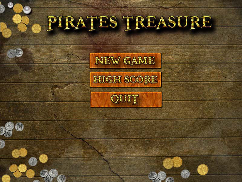
I went ahead and left it like this for a week or so and then further refined it to its current state which is this image:

I eventually figured out the extremely huge sign post was not really doing much for the menu! So I lowered it down.
I added more landmass and made the dotted line describe a path that might actually be a navigation route as several friends had focused in on that as a "how would they go over the land at this point and then back over the water here?"
And its funny you know - it never bothered me at all .. it was just a dotted line going to an X , but 3 separate people gave that as their very first feedback.
I suppose if that's all they had to say it must be overall decent screen but I certainly would rather have them focusing on something positive than a confusing or perceptually negative thing.
The feedback about this screen has been better - with people noting they like the compass in the bottom right and they like the overall colors and sense of the treasure map feeling it gives.
So for now this is where I stand. But honestly I am still ready to completely scrap this screen and move to something else more inspiring if I can come up with it.
I sincerely think you should be ready to scrap anything you have if you come up with something brilliant to replace it and the work to change the items is not prohibitive compared to the return on the new idea.
Inspiration doesn't come that often but when it does we need to be available and ready to act upon it!
Like the 15 minutes it took to make the first version of this screen - maybe another flash of 15 minutes in a couple of weeks will net me something twice as good?
I'll keep you posted if anything interested crops up!
No comments:
Post a Comment